Buried In Words - Roadwarden Devlog
(Roadwarden is an illustrated text-based RPG in which you explore and change a hostile, grim realm. It combines mechanics of RPGs, adventure games and Visual Novels, and you can now wishlist it on Steam!)
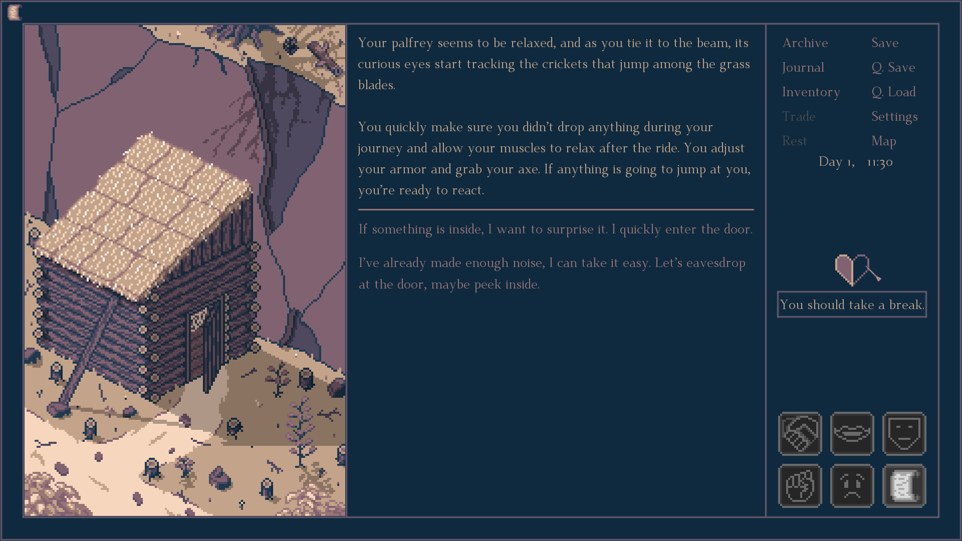
Since the middle of December, working on Roadwarden is mostly about writing new events, dialogues and quests. There were almost no updates on social media - I don’t have time to draw (aside of some inventory icons), and by popular demand, I try to avoid
deeper spoilers. I’ve written quite a bunch of stuff, but the results won’t do for exciting screenshots.
I’m currently focused on designing and filling up Howler’s Dell, the largest settlement in the game, so there’s a LOT of important character interactions to introduce, including quests, merchants, and lore. But in the meantime, some major changes have also been introduced:
1. The game over screens
In the original Roadwarden’s Design Document, there were no game-overs. You could get significantly hurt during your journeys, but never to the point where you’d hit a brick wall that would make the further progress impossible. You’d need to rest and heal your wounds to participate in some events, but you could always move forward.
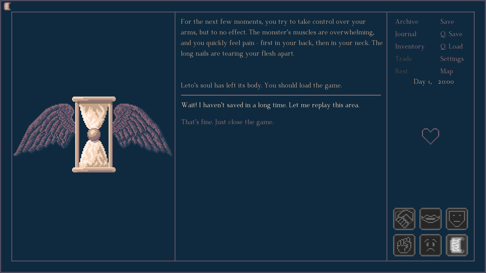
I’ve finally decided to change it. In most situations, reaching 0 HP won’t result in an instant death. But in some scripted encounters - usually when facing an overwhelming opponent while being completely unprepared - your character will be broken.
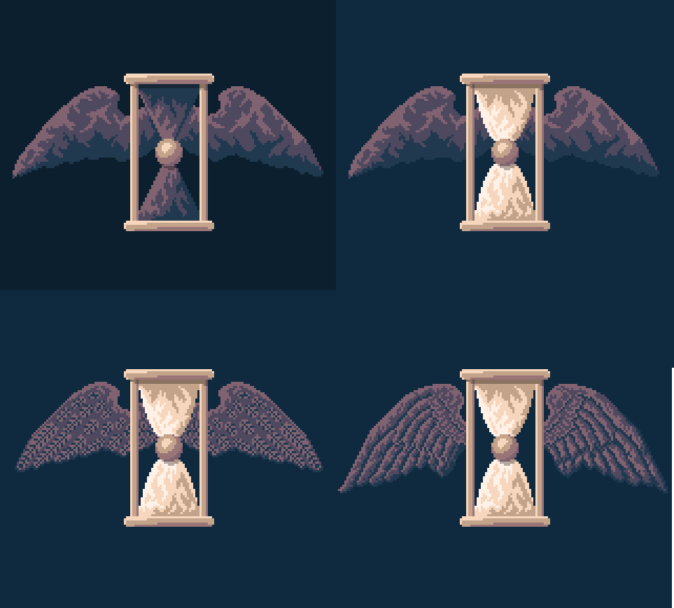
Still, I hope to make it as player-friendly as possible. Did you forget to save your game? Was autosave ran in an inconvenient spot? You can jump back in time a bit, no strings attached.
In various European cultures, the winged hourglass is an image related to the ephemerality of life, and it has became an important part of the Viaticum fantasy setting over ten years ago. Since there’s no single “canonic” design, I’ve had an opportunity to experiment with various approaches.
2. New “regular” font
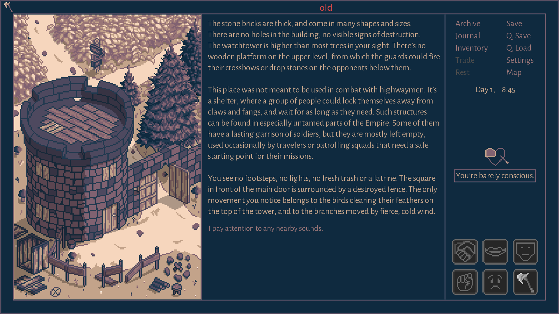
The text has now more space to breathe, the letters have more personality, and thanks to the serifs, it’s going to be easier to keep track of the lines you read. Everybody wins:
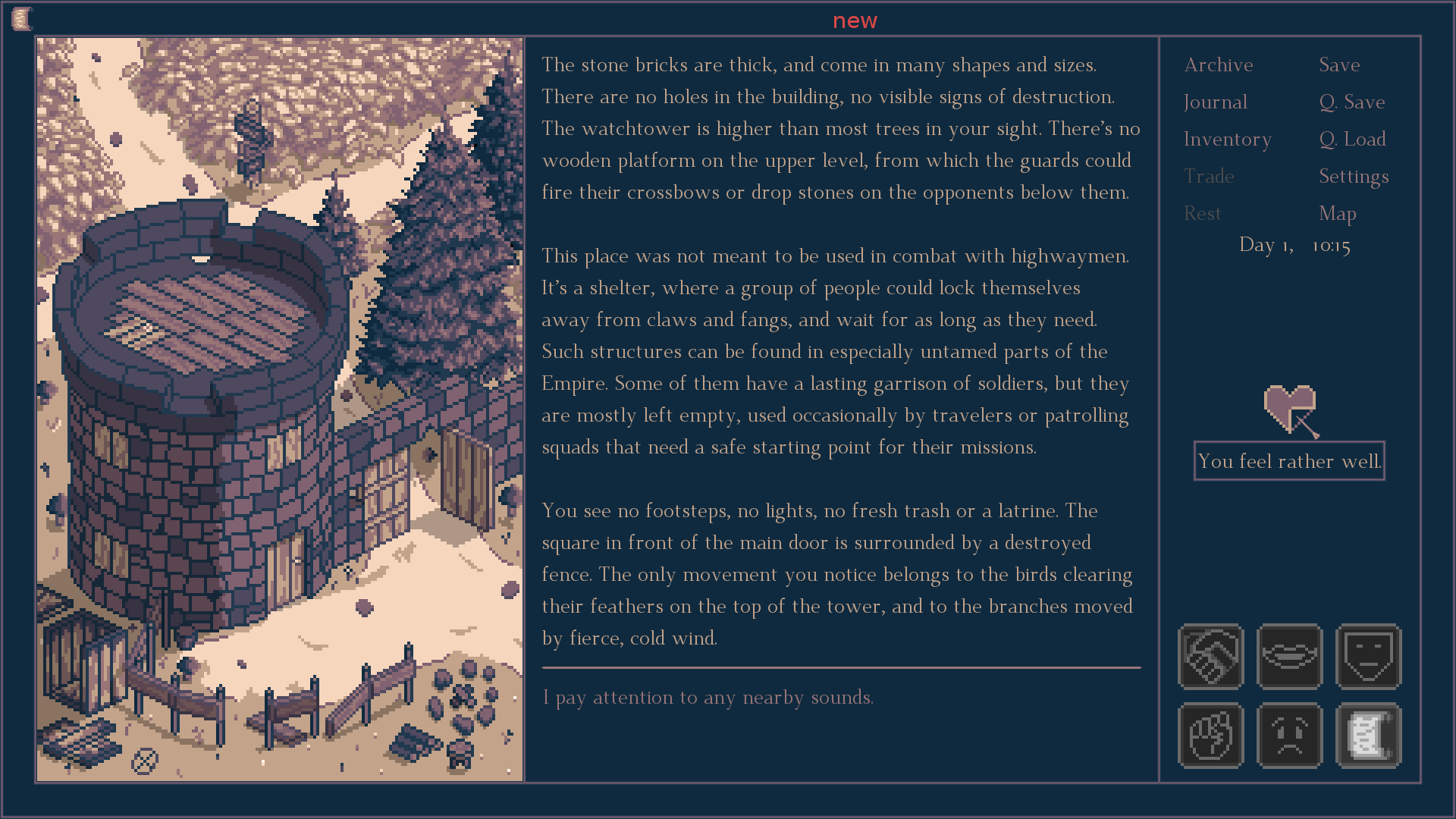
While the majority of feedback that I’ve gathered shares my enthusiasm, I’ve also seen some words of criticism. It’s still possible that the font is going to be replaced with a different one, but I’m convinced it’s still a step in the right direction.
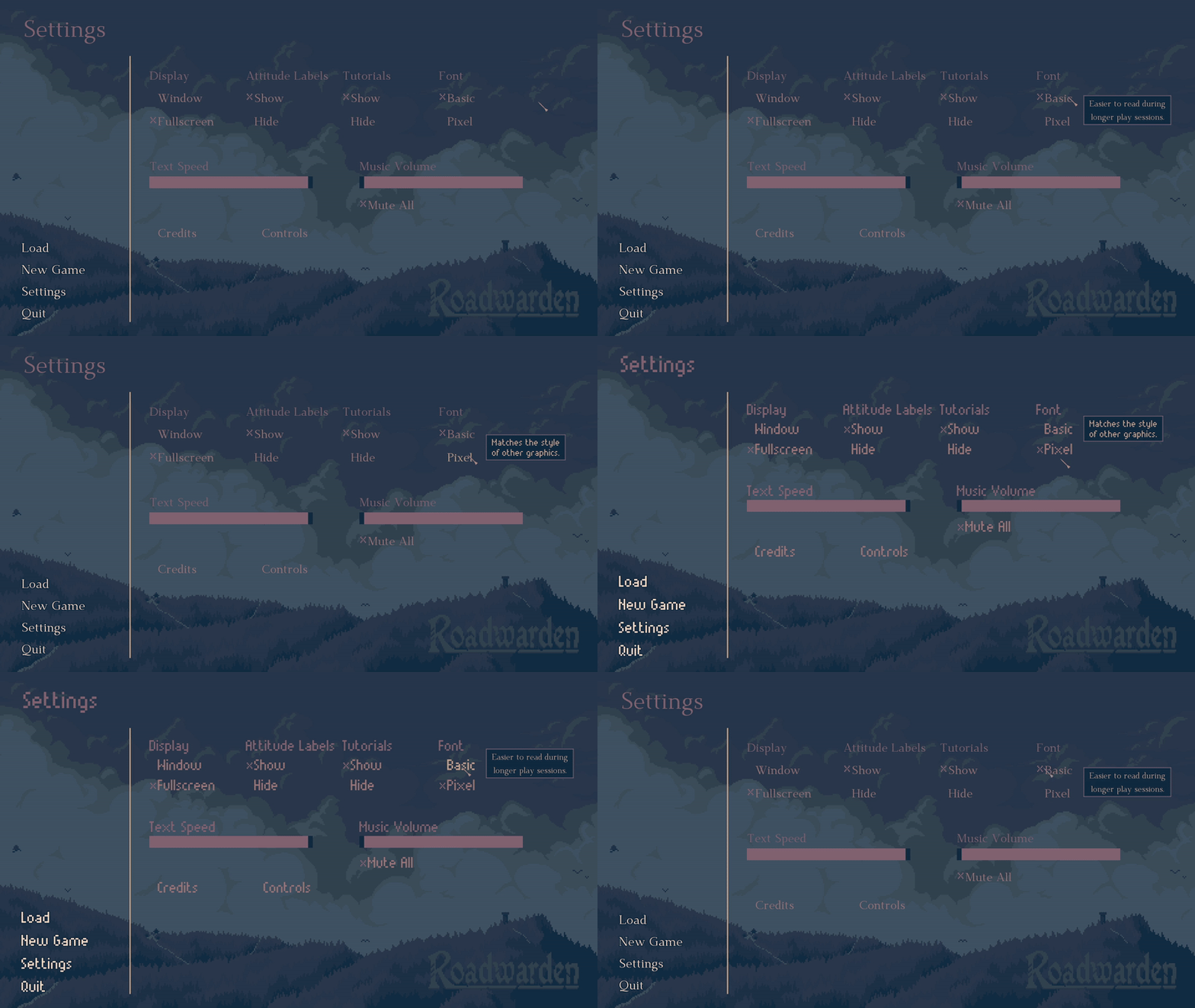
Even if the font is going to be replaced again, this little feature will be kept in the game. The good old “select a font” setting now showcases a small frame that explains the most significant traits of the regular font and the pixel one. Even though the pixel font looks cool on screenshots, it won’t be gentle on your eyes.
3. Updated inventory menu
From now on, pointing at an icon in your inventory will showcase not just the item’s brief description, but also its name.
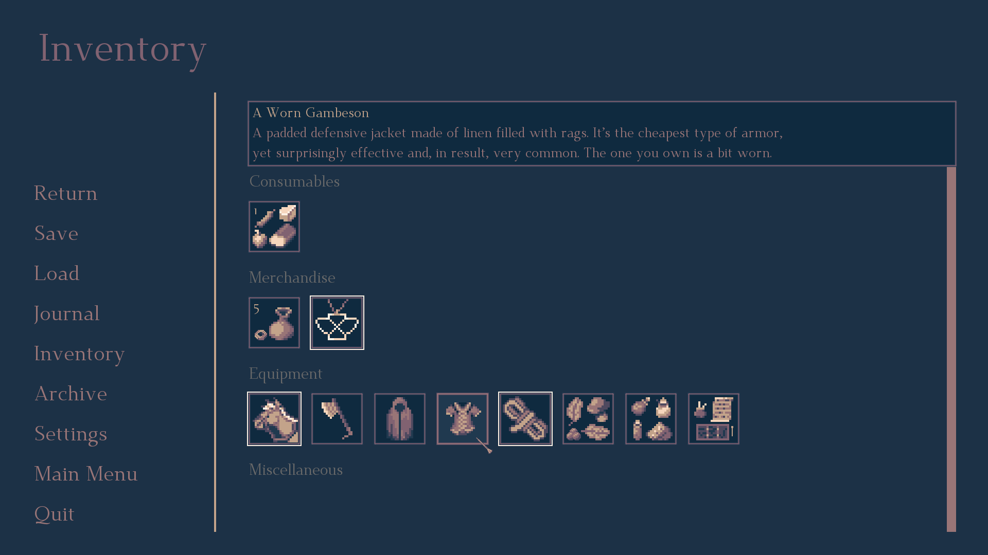
This update was essential due to the constantly growing number of items added to the game. Usually, the player will keep using or loosing some of them as they complete more quests or take a part in more unique interactions, but you may reach a point when you’ll see a couple of dozen of icons at once, and they may start to get a bit blurry. When there was maybe 20 items in the entire game, clicking an icon to see the broader description wasn’t a large problem, but it became clear that it was a short-sighted, flawed design.
4. Redesigned armor system
I’m not gonna lie. The gambesons that were present in the demo? They were a placeholder, waiting for a better idea to show up. And here it is.
The original two “types” of armor were related to the character’s class selected at the beginning of the game - the Warrior gets the good stuff, while both the Scholar and the Mage have a piece of trash, since they couldn’t afford anything better.

I was expecting to introduce some encounters “better” armors later in the game, and also script interactions where the better armors help you survive major injuries or even death, but I felt it was not good enough. This approach doesn’t introduce much decision making, and it introduces sort of a boring stagnancy.

The new system offers three “levels” of armor. The level 1 - “A Worn Gambeson” - offers you little to no protection. If you want to be saved during some difficult encounters, or maybe get less hurt when you screw up, you want to get to at least the level 2 - “A Decent Gambeson” - which is given to the Warrior class at the beginning of the game.
Upgrading armor requires getting in touch with a tailor, and paying them to do some fixes for you. However, when the armor “saves” you, it often also gets damaged. Its level decreases.
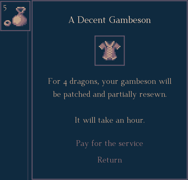
The 3rd level of your armor - “A Fine Gambeson” - follows the same rules. Wearing it will save you from most wounds, but during this process, it may also get torn, downgraded to level 2. As the player, you have to decide how many dragon coins you are willing to invest to keep yourself in one piece.
So simple, yet so much better. And I can still decide to introduce levels 0, 4, 5... Depending on what will turn out to fit the larger picture.
5. Updated journal menu
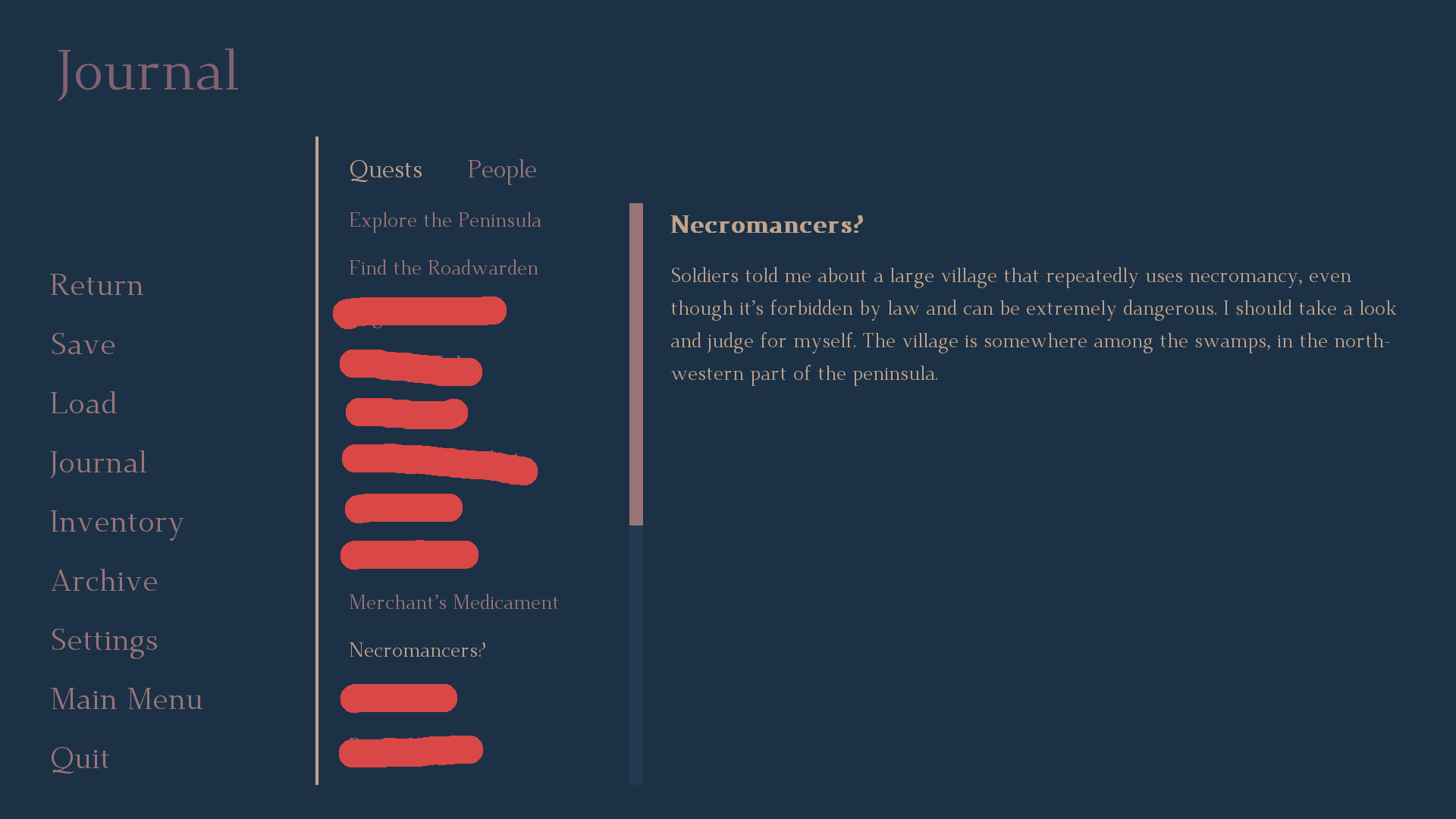
The journal has received the very needed scrollbars, which appear only when there’s too much text to fit in a single window. From now on, I don’t expect that the player will just “figure out” that they can use a mouse wheel, or drag the text box. Nice and easy:
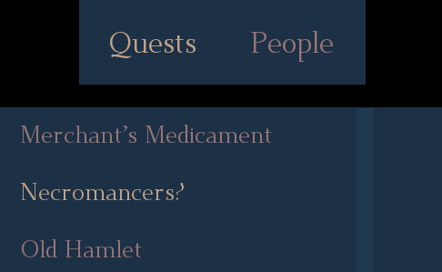
Also, when you select a chapter (like “Quests”) or a specific entry (like the “Necromancers?” quest), the button is now highlighted, what will help you keep track of what you’ve been clicking through:
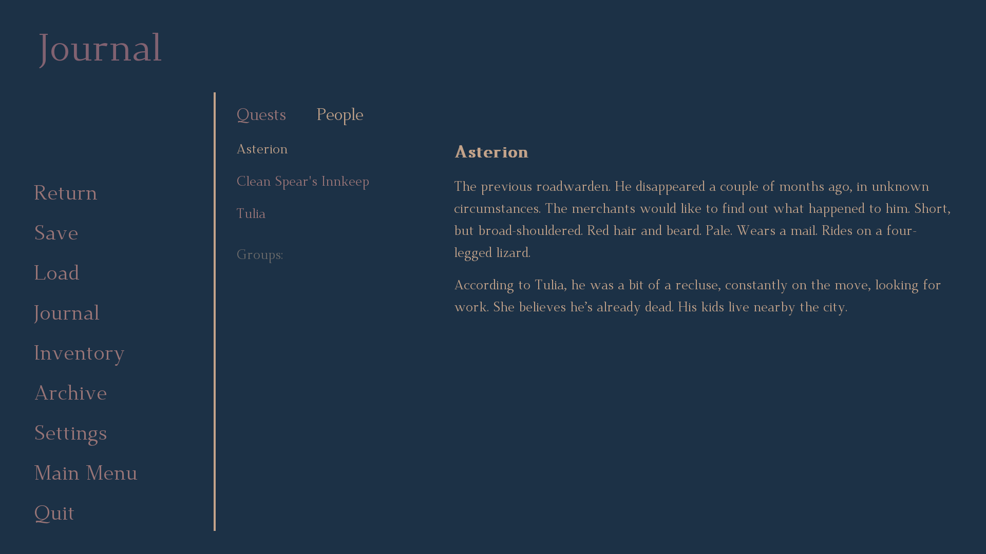
Also, unlike in the game’s demo, the “People” chapter is now cohesive with the “Quests” formatting. Originally, these sections had different sizes, what didn’t look as good as I intended.
6. Dolmen updates
Just to make it clear - the game receives a whole bunch of updates and bug fixes every week, and I don’t plan to list dozens of small adjustments just because. But this one is pretty fun for me, since it shows the progressing level of attention to detail, and the evolution of the game’s design. : )
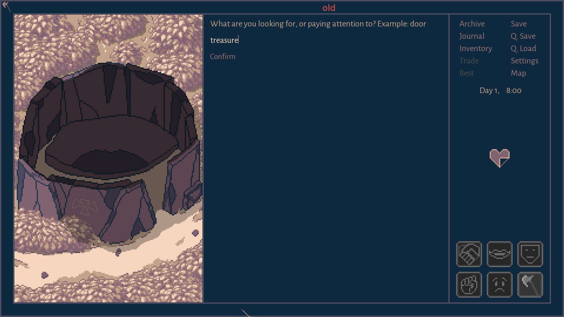
Since the day I’ve introduced this area to the game’s prototype, I was unhappy about the low amount of visual changes it had to offer. No matter what you’d type down to solve the puzzle, the only clues you’d receive were presented in text.
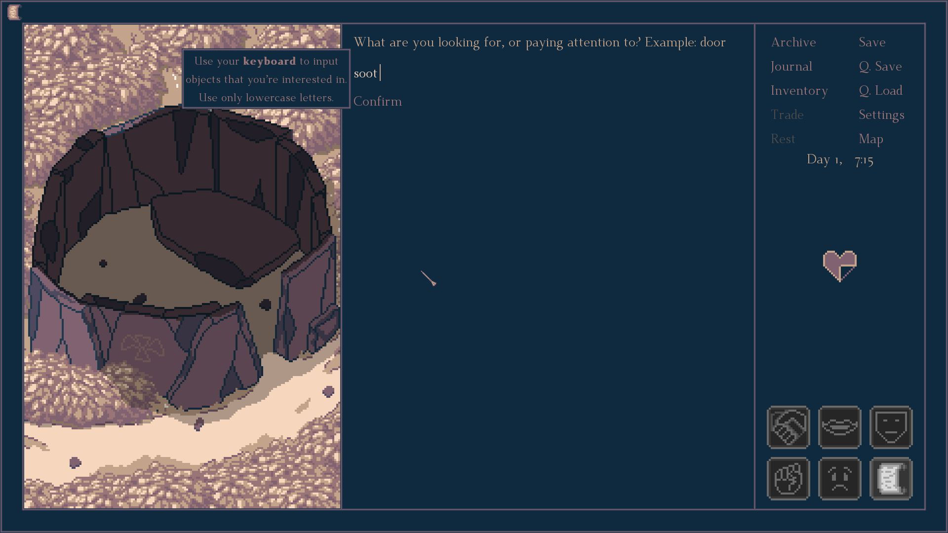
The updated dolmen required some rewrites and a fair bit of drawing, but from now on, once you find something that provides a significant clue, you’ll also see a visual feedback that’s going to reflect your discovery. It will help you backtrack the older information, and focus your attention on more successful guesses. Oh, something new has showed up? I guess it’s important!
7. The world map reworks
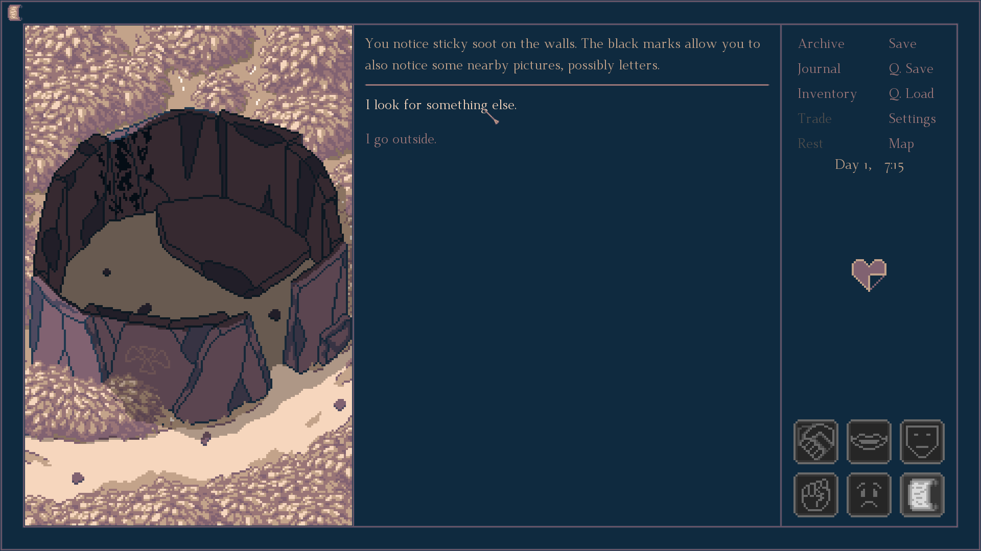
Some of those updates are difficult to spot without a looking glass. Some percentage of the “bushes” have different colors now and a couple of new shapes; the forests and trees now cast shadows; the lake nearby the Southern Crossroads has more details; the river in the east is broader; there are new hills nearby Tulia’s Camp...
But it’s the eastern part of the map that has seen some major updates. It’s filled with hills and mountains, and because of it, it provides more limited vision than lands in the west, covered with plains and swamps. Previously, this disproportion was quite a bit larger, and I’ve decided to town it down a bit. I hope that the effect I’ve had in mind is still clear to spot.
8. More “stable” text boxes
When the player points at an icon, it usually creates a text box with a related description. From now on, more of these text boxes will be anchored to specific parts of the screen, instead of showing up in an area related to the player’s cursor. It should make the information less chaotic, and won’t cover other icons anymore. Also, there will be no more situations when the text box is partially outside of the game’s window.

------------------------------------
Thank you for taking a look at this devlog, for your support and kindness. Remember, you can also find me on Twitter and Facebook, and the game has a Steam page on which you can add it to your wishlist. Have a great day!
Get Roadwarden
Roadwarden
An illustrated text-based RPG in which you explore and change a hostile, grim realm.
| Status | Released |
| Publisher | |
| Author | Assemble Entertainment |
| Genre | Role Playing, Adventure, Visual Novel |
| Tags | 2D, Dark, Fantasy, Isometric, Meaningful Choices, Pixel Art |
| Languages | English |
More posts
- The Final UpdateSep 12, 2024
- Roadwarden 1.1.31 AE patch notesSep 18, 2023
- Roadwarden Anniversary UpdateSep 13, 2023
- Roadwarden - Patch 1.0.66Nov 22, 2022
- Roadwarden - Patch 1.0.65Oct 25, 2022
- Roadwarden - Patch 1.0.6Oct 04, 2022
- Roadwarden - Patch 1.0.5Sep 26, 2022
- Roadwarden - Patch 1.0.3Sep 19, 2022
- Roadwarden - Patch 1.0.2Sep 16, 2022
- Roadwarden Released! + The New TrailerSep 12, 2022
Leave a comment
Log in with itch.io to leave a comment.