Taking A Fresh Look - Roadwarden Devlog
(Roadwarden is an illustrated text-based RPG in which you explore and change a hostile, grim realm. It combines mechanics of RPGs, adventure games and Visual Novels.)
The last four months were the most fruitful ones in the game’s development history. Never before so many words have been written down, quests and other activities added, coding bugs and linguistic mistakes fixed. After this very long run, the game’s volume has increased by a good couple of hours, mostly thanks to the implementation of (almost) the entirety of the in-game largest settlement. There’s a Lot of content now.
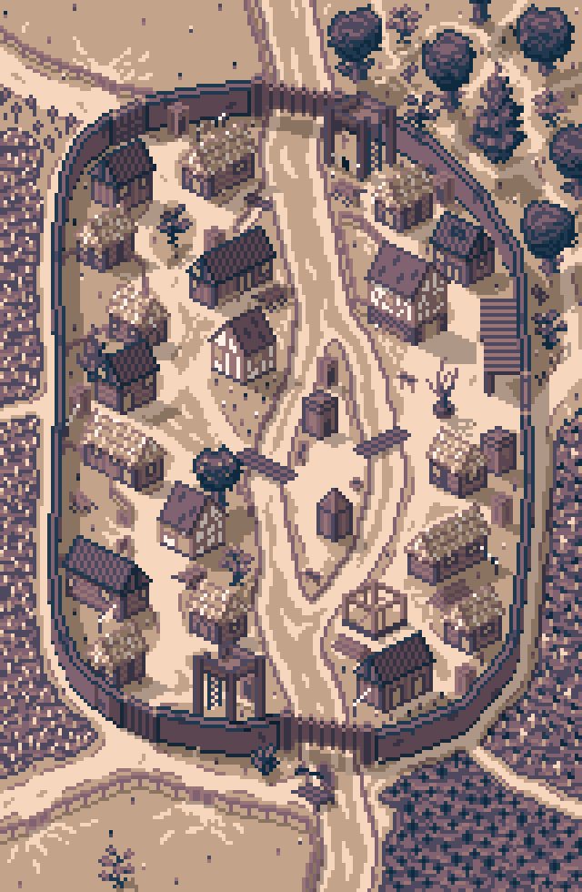
Not only that - the game is also in the middle of major reworks. Some of the core parts of the interface were modified and while it’s very probable that they are not in a perfect shape and need some additional testing, I believe the game is successfully pursuing something that’s very important to me - the clarity of information.
1. It’s now easier to notice the changing hit points

Up to this point, the reduction and gain of HP was only presented by the “current HP” icon. The new, very simple animation is meant to mark the spot when the player’s HP has been altered, and stays “in the air” for long enough (or so I hope) to attract one’s attention.
2. The regular “clock” has been replaced
The previous clock was presenting arbitrary values without any interpretation. Knowing when it’s “6 AM” or when it’s “14:00” doesn’t mean much if you don’t have dynamically changing visuals. I also don’t want to make a special tutorial section of “here are the specific hours which you need to memorize. for example, remember that 21:00 marks the beginning of the night!”
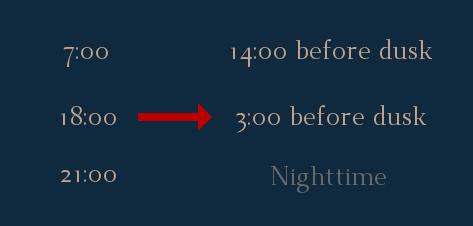
Since the time of the day is an important part of Roadwarden’s mechanics - you can’t travel after dusk - I’ve decided it’s important to clearly demonstrate how much time does the player have left. It’s possible that the current display will still be changed to make it look better, but we’ll see.
3. The notifications have been pushed to the center of the screen
The problem with the old notifications is that they appear too far away from the most relevant part of the screen - the text section. Very often, a notification was simply ignored by a focused eye, so the information it presented was missed. The idea behind this change is to allow the eyes to naturally head toward a popping out message.

Also, these notifications last for longer, while the “Quick save completed” now disappears quicker than before. Previously, all the notifications were lasting for the same amount of time, and I believe it was a bad approach.
4. Unlocking a new shelter or a trader results in a new notification

Thanks to the new notifications, it will be much easier to notice that the new “shelter” (a place where a player can sleep) or a new “trader” (a shop or a service provider, like a healer) are available.
5. The Archive has been updated
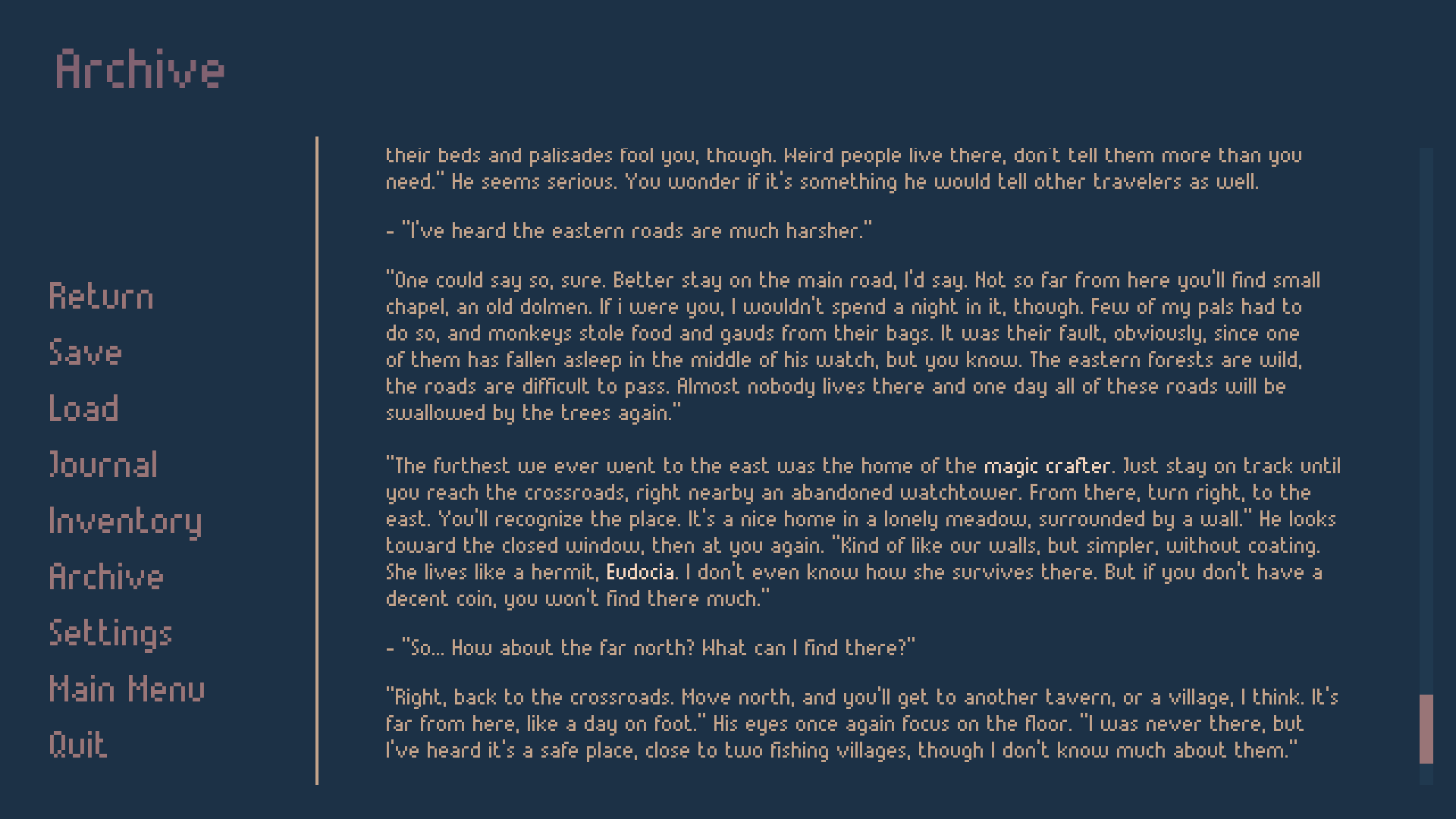
Many people have various ideas how to improve the Archive - a menu which saves a bunch of past dialogue blocks - but these suggestions are often outside of my humble scope of skill. Nevertheless, various bugs related to the Archive were fixed, and it has been limited to a couple of dozens of dialogue/narration chunks at once. It’s now a tool that can do fewer things, but in a more accessible way, so I think it will be more useful.
6. The world map was adjusted
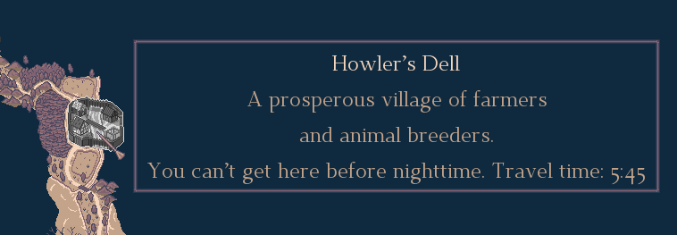
The text boxes displayed on the map are now anchored to a specific spot - the place where they’re displayed is not related to the mouse pointer anymore. It’s mostly a cosmetic change, but sometimes the text boxes were acting a bit unpredictable.
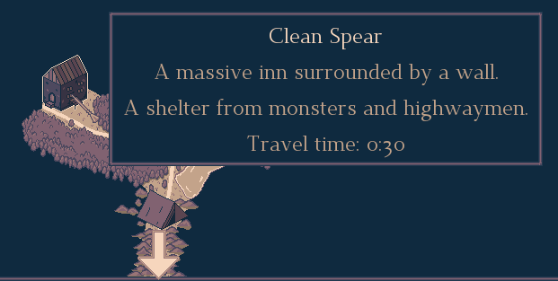
Not only that, but the general contents of these text boxes are also modified. The vast majority of presented areas now display their names and offer more lore, or at least a more detailed description, using the fact that the area’s name already covers a lot of information.
7. The tests of the new font have begun
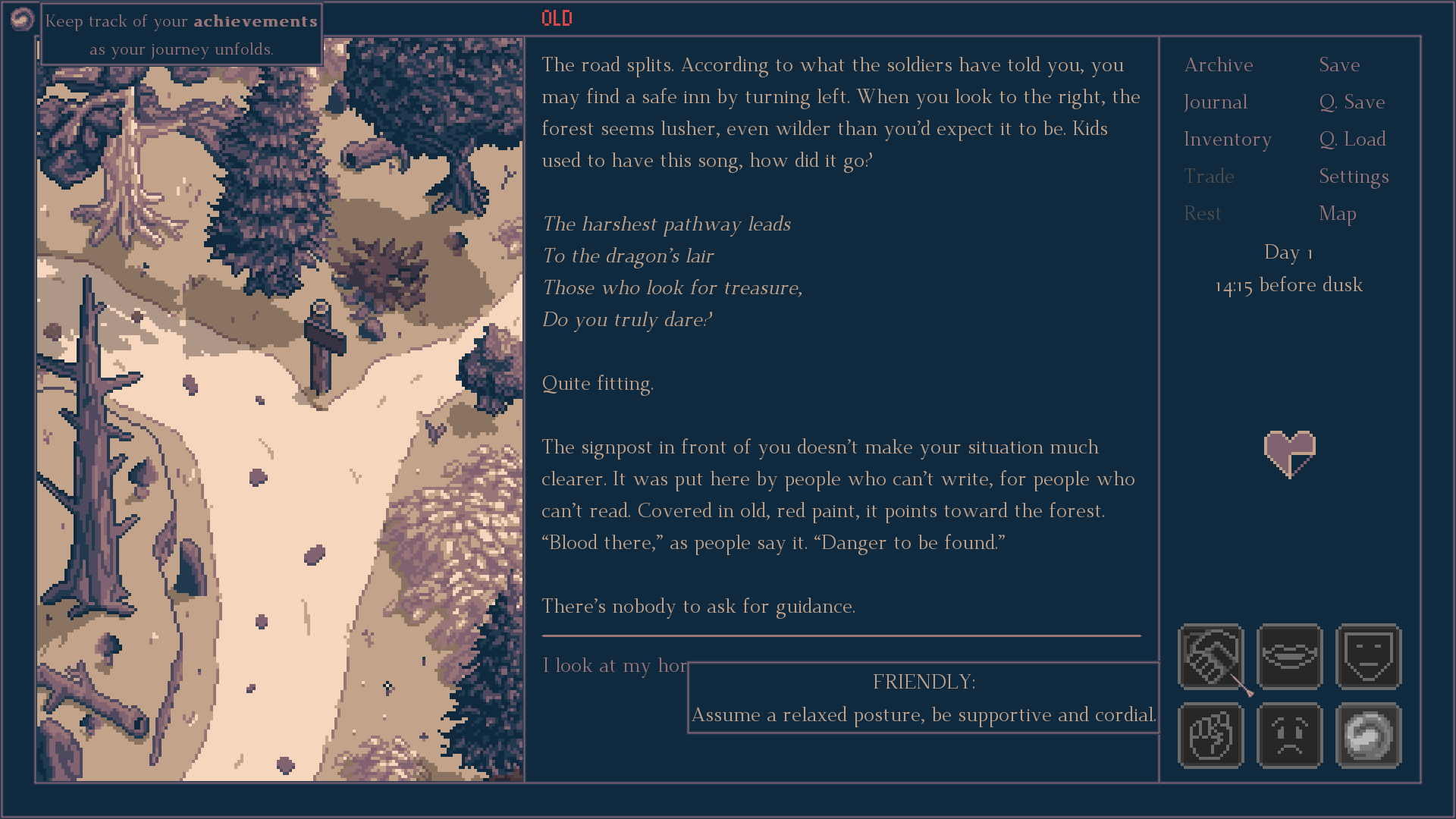
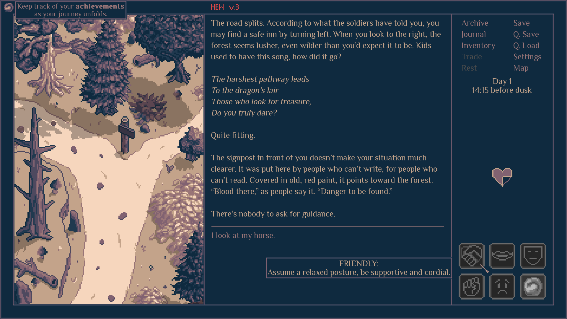
During the last couple of days I’ve been testing and consulting with many people the potential usage of a new font. I believe that the previous one has covered too much space, yet
it also had letters that were too thin to comfortably read them. There are still adjustments to be made, but it looks like this change has been welcomed by many kind words.
It’s always tough to sacrifice appealing visuals for the sake of readability, but it’s very important to make a text-based game as gentle to one’s eyes as possible.
------------------------------------
Thank you for taking a look at this devlog, for your support and kindness. Remember, you can also find me on Twitter and Facebook, and the game has a Steam page on which you can add it to your wishlist. Have a great day!
Get Roadwarden
Roadwarden
An illustrated text-based RPG in which you explore and change a hostile, grim realm.
| Status | Released |
| Publisher | |
| Author | Assemble Entertainment |
| Genre | Role Playing, Adventure, Visual Novel |
| Tags | 2D, Dark, Fantasy, Isometric, Meaningful Choices, Pixel Art |
| Languages | English |
More posts
- The Final UpdateSep 12, 2024
- Roadwarden 1.1.31 AE patch notesSep 18, 2023
- Roadwarden Anniversary UpdateSep 13, 2023
- Roadwarden - Patch 1.0.66Nov 22, 2022
- Roadwarden - Patch 1.0.65Oct 25, 2022
- Roadwarden - Patch 1.0.6Oct 04, 2022
- Roadwarden - Patch 1.0.5Sep 26, 2022
- Roadwarden - Patch 1.0.3Sep 19, 2022
- Roadwarden - Patch 1.0.2Sep 16, 2022
- Roadwarden Released! + The New TrailerSep 12, 2022
Comments
Log in with itch.io to leave a comment.
An amazing game - great writing, artwork, music, and mechanics (attitude is a smart one!) All fits together seamlessly. A truly immersive experience.
<3 <3 <3 Thank you so much! I'm so happy to think that even if Roadwarden is weird and not for everyone, there are people who can get immersed in it.