Banging My Head Against A Brick Wall - Roadwarden Devlog
It was a great weekend, a suitable ending for the long, long chapter of Roadwarden’s development. The game’s code is now much cleaner and it allows to add the new content easier and quicker. And I had quite a bit of content to add. New dialogues, new graphics, new activities.
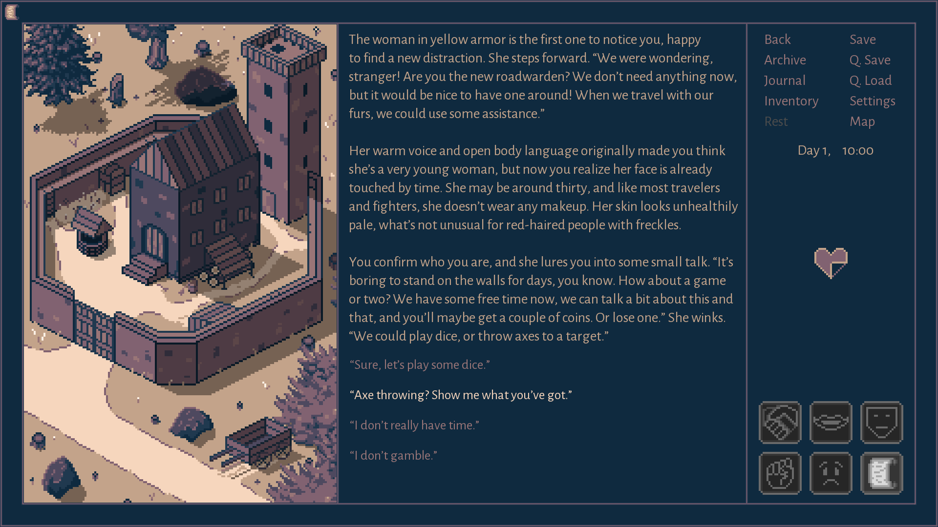
The Clean Spear tavern has a new “chunk” of interactions now - the player can spend some time with the guards to gather new information about the world or other character. It all started with a minor, throw-away NPC added for some color, but once I figured I really like this group of characters, I decided to bring some quests and unique actions to the table.
It increased the amount of conversations for this area for about 30%, but the more I wrote, the happier I was.
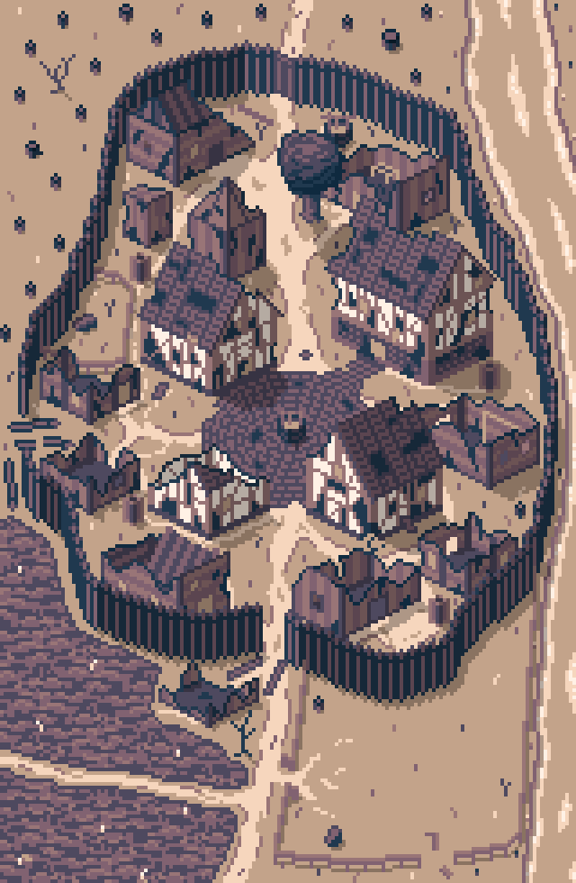
The ruined village, the next area I’m going to write for, has sparked a lot of interest, especially on Facebook and r/worldbuilding. It has a lot of lore behind it and revealing the “true” nature of this place will be one of the side quests, but here’s the general description:
“A ruined village. The Imperial forests are dangerous and unfriendly, forcing the hamlets and villages to grow as slowly, as they can. If humankind affects the nature too much, too fast - the monsters arrive to take back what belongs to them.”
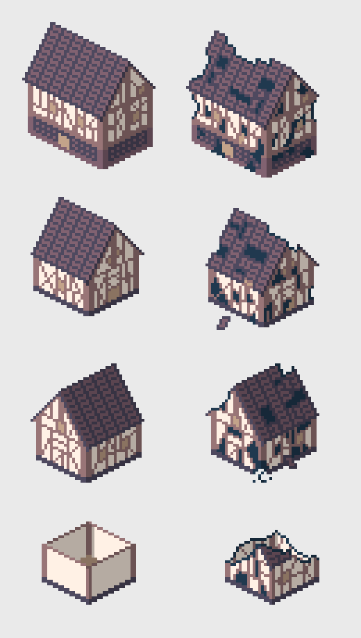
However, working on this area wasn’t easy. The buildings alone took me literally a day. Those of them that are more detailed and larger, were first designed in their “clear” form. After that, I’ve added the damage from fire, time and animal strikes:
What’s more important, however, is that originally I planned to make all of the buildings half of their current size:
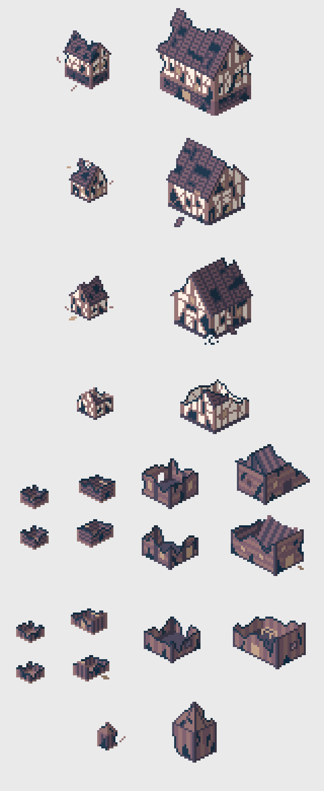
Unfortunately, it was a bit of a mess and I couldn’t portray too many details in such a restricted sprite size. Redraws were necessary, but making tiny structures is generally really fun.
The real problem, however, involved the bottom left corner of the image. My goal was to portray an old field, but people were seeing a dirty body of water, or even a forest. Here you can find a couple of stages that this one corner went through:

With such a limited set of colors, textures are sometimes enough. Adding the road in the middle really helps, a new context comes to mind.
In total, this image took me about 3 days. Yikes.
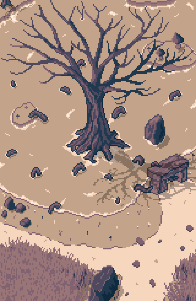
“At the edge of the swamp, a large tree stands for as long as anyone remembers. It has no leaves, yet slowly grows. To stay alive, however, it has to be fed by the locals, who put their offerings on an ancient altar.”
This picture took me just a day and I’m very happy with it. Some details had to be reworked or moved around (and the feedback I’ve gathered was very helpful), but since it repeated a lot of things that I’ve already had figured out, it was much easier to put my experience to use.
That’s why I don’t find the time spent on the houses or field to be a waste. Previously, I’ve spent hours trying to make water that look like water, a road that looks like a road. Now that I know how to do it, it all clicks much faster. Next time I’ll also be able to handle the field much better.
So I’ve decided to make another, small image and have it ready on Monday. A one room that’s placed in the village ruins. A place where an NPC has set a small camp, where he scavenges for scraps of iron and steel. Should be easy, especially since I already had a tent some stairs, barrels, a chest... SHOULD be easy.
Now, join me on my road to madness.
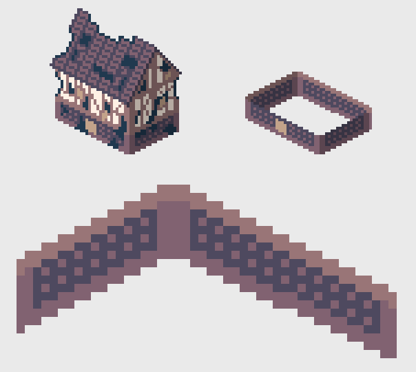
I wanted to place the tent on the “ground floor” (more like an above-ground basement) of the largest building. I’ve reconstructed the basic room structure, and here is what I’ve started with.

The first skeleton of the structure. It’s clear that the texture in the middle won’t work, but the base idea is here. Rocks on the bottom, bricks in the middle, wood on the top and in the corners. Not a practical design, but a pretty one.
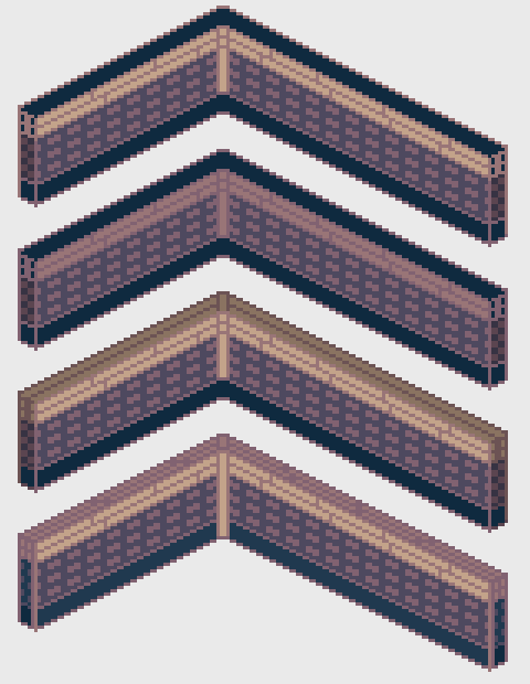
First textures, testing various colors. The wooden pillar in the middle doesn’t work well, but the largest problem is the part in the bottom. I haven’t figured out any good texture for it, so I leave it for last.
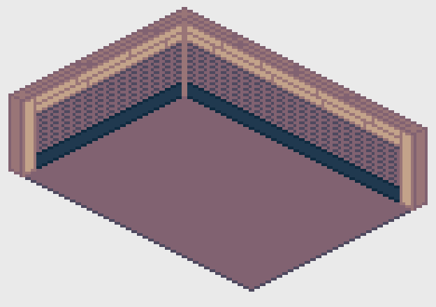
New bricks, floor and decent wooden pillars. At this point I had to decide if I want to start working on the rest of the room, or keep digging into the walls. I’m digging.
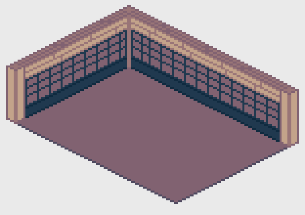
I see a potential, even if it looks awful.

While trying to make the bricks more interesting, I decided they look really good and finally quit my idea to make the bottom part a “rocky” section. Bricks all the way.
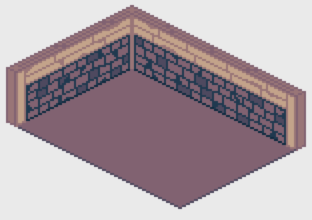
Legit!
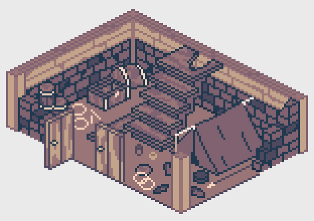
First version of the chamber. It could use some extra light.
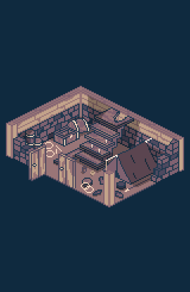
See? Fun!
---------------------------------
I still have a new area to draw in mind that I have to take care of soon, then I can sink into some new dialogues and exploration bits. After writing all of it, I’m going to work for a bit on my code and add / modify some of the features. The diary needs a “characters” section to make it easier to remember all the NPCs.
A lot of things to do, but the support I’ve recently received was huge and I’m getting quite optimistic about this entire endeavor! Remember, you can also find me on Twitter, Facebook and the game’s website!
Get Roadwarden
Roadwarden
An illustrated text-based RPG in which you explore and change a hostile, grim realm.
| Status | Released |
| Publisher | |
| Author | Assemble Entertainment |
| Genre | Role Playing, Adventure, Visual Novel |
| Tags | 2D, Dark, Fantasy, Isometric, Meaningful Choices, Pixel Art |
| Languages | English |
More posts
- The Final UpdateSep 12, 2024
- Roadwarden 1.1.31 AE patch notesSep 18, 2023
- Roadwarden Anniversary UpdateSep 13, 2023
- Roadwarden - Patch 1.0.66Nov 22, 2022
- Roadwarden - Patch 1.0.65Oct 25, 2022
- Roadwarden - Patch 1.0.6Oct 04, 2022
- Roadwarden - Patch 1.0.5Sep 26, 2022
- Roadwarden - Patch 1.0.3Sep 19, 2022
- Roadwarden - Patch 1.0.2Sep 16, 2022
- Roadwarden Released! + The New TrailerSep 12, 2022
Comments
Log in with itch.io to leave a comment.
Very interesting dev log, thank you for taking the time out of doing actual work to keep us updated.
I'm glad you like it! I think that having such step-by-step examples may be interesting, especially when there will be an opportunity to look back after the game's release. : )
Great post. What paint program are you using for the art work? I love the ruin buildings.
I do have one little piece of feedback for the edge of the swamp large tree stand image, within the image to the left i cannot help but see a face with x out eyes and a long tongue going into the water. I know its suppose to be two little crosses and tree roots being the other things in the water? Im not sure if others see it that way too? perhaps you could remove one of the crosses to make it less like a face.
Thank you, Daza! I use Pyxel Edit for more than 95% of the time, and sometimes I copy some objects to modify them in GIMP - especially when I want to replace some colors with others.
And thank you for your feedback! I think I need to stop using these mushrooms if people perceive them as "crosses." : P Now that you mentioned the face, I wonder if I can add it somewhere purposefully. : D
I didn't even realize they were mushrooms. They looked like generic ground cover/texture.
Thank you for your feedback! I'll now have these bad boys to work with. : P
I didn't see it until you mentioned it, but now it cannot be unseen.